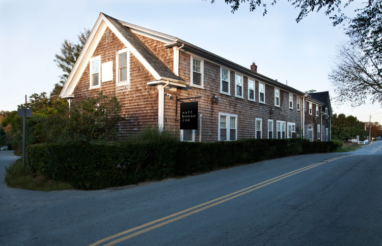
you may have noticed this gem in my best of the magazines post from june. when i saw that one little shot of a guest room, it was simply not enough; i knew we needed to do a little more exploration. care to join me?
this is the salt house inn. according to fodor's, this idyllic 19th century property was purchased and renovated in 2011 by co-owners kevin o'shea and david bowd, who have impressive experience in hotel design and management. it is located at the tip of cape cod in provincetown, massachusetts. i wish i could say i knew where that was, but i have the navigational sense of a lemming. i'm thankful on a near-daily basis for google maps.
the design of the common room is about as perfect as it gets. a little bit country, a little bit modern, a tad rustic, with a giant painting of a man on a horse. and a tulip table. baaaaahhhgggh. (that's the noise i make when a design is just indescribably awesome. also, my pastor would be mad at me for using the phrase 'indescribably awesome' about a living room. so, baaaaahhhgggh. it works. you get it).
two bad things are happening in this picture. first of all, i found it at remodelista, which i discovered in my research is among many sites that are also obsessing over this lovely inn. that might make it kinda hard to book a spot. secondly, it is making me crave bethany's scones again. like, really bad.
this photo of a guest room is from trip advisor, where the salt house has high ratings and rave reviews. each guest room has all-white shiplap walls and a collection of found objects above the bed. and yummy goodies in the bathroom.
conde nast traveler is giving it some love too, naming it to their '2014 hot list of best beach hotels.' i'm noticing the streaky multicolored wood floors and that great wire pendant over the floating clawfoot tub.
that tub can be found in 'the loft' on the salt house's room menu, in case you're interested in a soak. here's a view of the bed in there:
and some of the other guest rooms:
this one is a deluxe king. loving the gallery of lanterns. wouldn't that be easy to do with a handful from ikea and a can of red spray paint? it would be perfect on the screened in porch at my lake cabin. (note: i do not have a lake cabin).
here is one of the typical bathrooms. it is interesting to note the paint in this room. they did the bottom half of the wall charcoal grey without any kind of chair rail (rebels!) and included the window trim in the two-tone treatment.
this photo of the balcony, another eclectic and idyllic spot to relax and sip, is from boston magazine, who named it the '2013 best inn, cape cod.'
for those who know me, they know i'm not a big traveler. i love my house and i love being there (and i hate to pack). but they also know that the one place i really do want to go is boston. it is on my bucket list big time. so of all the things i fantasize about, going to this inn has at least a decent shot of coming to fruition. especially if the google maps app is working well that day.
yep, not a bad spot in the world. all photos, unless otherwise noted, are from the salt house inn's website, where you can learn more about the inn and book a stay.
for more uh-mazing pictures and a review by real-life people who visited, please go see meredith and michael at map & menu. if you aren't already crying to go here, you will be. (...you will be).


.JPG)


.JPG)


What an interesting house! Thanks for the more in depth look:)
ReplyDeleteomg, i'm so laughing at the paddles above the bed...wanna know why? i just bought 3 at an antique store this weekend! i was going to put them in the basement in a corner, but now i'm thinking how cute they would look on the wall!
ReplyDeletewhat a great score! i love the look of old oars. my friend stephanie found some left in the garage of her historic house (lucky girl). she monogrammed one and hung them above the crib in her nursery. they look amazing! post a pic when you have yours up...
Delete